All artwork is subject to copyright.

Friday 5 December 2014

The Composer: Sergio De La Puente (Part One)

Finally we get to the music! Music in film is one of my great passions which is why it was such a pleasure to work with my composer on the film Sergio De La Puente who created an original live orchestral score for the The Ledge End of Phil.

I'm going to depart from the normal blog set-up here to leave you in the hands of the Maestro to tell you about his experience on the film and to let you check out some of Sergio's personal video clips from the live recording sessions. In the clips you can see Sergio's talented collaborators performing to a workprint of the The Ledge End!


"It was both a great experience and a challenge for me to tell the story of a man and a bird through the music alone. From the beginning Paul had told me that he wanted to differentiate the world inside the office from city outside musically. So I searched for that balance in the instrumentation, assigning wind instruments to the seagull and strings to Phil. Always joining them with piano. Then ultimately merging the two instrumentations so the two characters "fly" together. For me it is a great honour to work with Cartoon Saloon and talents like Paul."

Sergio De La Puente


In the next blogpost I'll be writing about how we came to the final sound of The Ledge End as well as posting more examples of Sergio's beautiful score!

Friday 28 November 2014

14. The CG guy: Ian Claffey

Ian Claffey who I wrote about in the How it all Began... post had been a part of Phil from the very beginning. I've known Ian since we went to college together in Ballyfermot College Dublin and The Ledge End of Phil had originally been written and conceived to be a low/no budget CG film between the two of us, with Ian doing the CG modelling, rigging and animation. The film was then slated to be cartoon saloons first CG film, and eventually became an almost entirely traditional 2D film... almost!

When I rewrote the film in the new 2D direction it was with the concede that the film would be 2.5D. Which can mean anything from drawings rigged with CG bones giving a 2D look, to cel shaded CG animation. In our case it meant that the character animation would be created with traditional 2D hand-drawn animation in TVPaint and then elements like the buildings, specific props and sets would be created in CG. Which would allow us to use more elaborate CG camera movements, depth of field etc.


We had ideas to use painterly focus, so that when we racked focus between characters the backgrounds they wouldn't just blur they'd become something closer to a painterly sketch. Which we thought was ingenius for about a week and then realised that Disney had already done this in Bolt! Still we did tests to see if there was a signature way we could approach it. But eventually with our timeframe and budget we eventually decided it wasn't essential to the story. Which is why we focused it into the painting style of the backgrounds instead.


A crucial plot point in the film is that Phil's work is so important to him that he would blindly risk his life for it by following a page out onto the ledge. So it was important to me that the page at least have something written on it! Instead of the bargain bin trope of having a hand drawn animated page which is blank. So we decided that the pages would be CG with Ian animating a hurricane of pages and creating a line style for the CG that mimicked the characters rough pencil style.


In the script the fan rotating back and forth was an important part of the story. So at the beginning it seemed the fan would have to be created in CG and Ian set about modelling and animating a great looking deskfan. In fact here is an early integration test with Ian's fan model on one of Stefano's backgrounds.


Design sheet by Stefano Scapolan based on Ian Claffeys CG model.

It was important from the script stage that the city be a character in the film. the thing is we weren't really sure what that meant visually, what the buildings would look like, how vast the world was and exactly how many buildings we were talking about! Ian and his CG toolbox became a useful tool throughout for pre visualising cityscape compositions and angles. 

But as we moved further into production we began to realise that the strength in the films visual storytelling was going to be less is more. The more flashy camera work I had thought was essential gave way to a more restrained/controlled approach because the story required it. As clichéd as it sounds it became more about what the story needed from us rather than what we wanted to show we could do. 

Ultimately we lost the rotating fan because it wasn't essential to the storytelling, instead Ian's CG model became a great reference model for Stefano who painted it into the 2D backgrounds. The buildings and cityscapes Ian had built where again not used directly in their CG form but where used as reference for 2D drawings for backgrounds, and for finding more dynamic cinematography. In the end the vast array of options that CG opened up to us allowed us to see the possibilities of what was possible with the story, but also forced us to look at our design decisions more clearly, and eventually to strip it back to it's bare essentials. But the point is we never would have reached the look of the final film without Ian's awesome contribution!

Next week we finally get to the MUSIC! Where I'll talk about Sergio De La Puente and the original score he created for The ledge End of Phil!

Friday 30 May 2014

The Ledge End of Phil to represent Ireland!

We're very proud to announce that 
The Ledge End Of Phil (From accounting) has been selected to be the sole representative of IRELAND this year at the

"ONE Country ONE Film Apchat International Film Festival"! 

The Ledge End will have it's French premiere at the festival between July 24th to July 27th


And if you're in the Louisiana area in July you can catch Phil at the 2014 Baton Rouge Irish Film Festival! July 18th


Also a big thanks to the lovely folks at The Corona Fastnet Short Film Festival last weekend, where The Ledge End of Phil (from accounting) was shortlisted in no less than three categories!


Best of Festival

Best Irish Short Film

Best Screenplay

Friday 16 May 2014

13. Layouts and Backgrounds: Stefano Scapolan

As I mentioned in the colourscript post Stefano originally came onto Ledge End to work on the colourscript and then stayed on to do layouts and backgrounds which was supposed to be for 6weeks.... but instead Stefano ended up staying on the project for 6months! Creating somewhere in the region of 96 original backgrounds for the film.

I had very clear ideas of what I wanted going into the film, of how the backgrounds would be designed to be part of the visual storytelling. But working with Stefano brought a sense of painterly texture and subtlety i couldn't have imagined. Though alot of the crew members on Phil worked remotely in other parts of Europe Stefano was sitting beside me throughout the production, which meant we came to understand each others strengths and weaknesses and evolved the storytelling style within the artwork intuitively.


Depth of field was something that had been crucial in the script stage in how I wanted to reflect Phil's inner story. As we started to push the style of the backgrounds we expanded our explorations from the colourscript (our using a painterly approach to mimic the effects of live action lenses and focus) to a painterly style based that collapsed the interior depth crushing the office into a flatpack, and expanded the outside world into daring vibrant landscapes.

We worked alot with the idea of "eye protein" (a term im stealing from guillermo del toro) if "eye candy" is beautiful things happening on screen with no real depth or input to the story "eye protein" is trying using all of the elements within the frame to reinforce what you're trying to tell the audience. The characters surroundings reflecting his inner emotional life.


Stefano's input to the film is immeasurable, the backgrounds went from what could have been pretty backdrops to beautiful animation to being cinematographic elements inherent to the films storytelling.

You can check out more of his great work on his website here: Stefano Scapolan

Thursday 15 May 2014

Upcoming Festival screenings!

Hey folks so we have some festival screenings coming up, maybe in a town near you!


The Corona Fastnet Short Film Festival
Schull, Co.Cork, Ireland

Fri 23rd of May

http://www.fastnetshortfilmfestival.com
/archive/2014-festival-programme/


Palm Springs International ShortFest
California ,USA

June 17-23, 2014

http://www.psfilmfest.org/


The River Film Festival
Padua, Italy

28 May to 9 June

http://riverfilmfestival.org/en/

Monday 12 May 2014

12. TRAILER 2D Breakdown

I think it's hard to process what goes into each shot of an animated film when you're only seeing the final polished visuals

So to pull back the curtain a little I've taken a section of the film we already have here on the blog, the trailer and recut it with the original layouts and animation as they look before we go into painting grading and fx.


With character animation by Jose Antonio Cerro and Vittorio Pirajno. (Excluding the opening shot of the hand straightening the picture which was animated by our great production intern Alex Bernas)

and layouts by the incomparable Stefano Scapolan, enjoy!

Friday 2 May 2014

11. Animating the Seagull: Vittorio Pirajno

Animation had started, the production was building momentum, sand timers were filled with coins and were accumulating small piles at the opposite end, Jose had started animation on Phil...and still no animator for the gull....

We had in fact found a couple of animators who hadn't worked out for one reason or another, couldn't get the style or scheduling conflicts with other projects. I had spent so much time more worrying about Phil, I hadn't considered the gull being the hard sell

So compared to other members of the crew Vittorio came quite late in the game. Even when i was given his reel his stuff was great but i just wasn't sure if he was the right guy. It was Jose who said "trust me, this is the guy". So I gave vittorio the shot below, and he nailed it straight off! Vittorio brought the fun and spontaneity that the gulls character needed, and through out the film always added a little something to the performance that made it better.

This was the first shot Vittorio worked on, here you can see the progression from the initial rough (i spoke about above) to the final shot


On the animation for both characters I tended do redraws (taking take key poses from the animation and drawing over them) with Phil it was usually about bringing it back on style, making his movements more restrained, doing more with his eyes or small hand gestures if we could.


But with the gull it was the opposite, myself and vittorio went back and forth alot not to bring it back but to see how far we could push the little guy. When Vittorio would do a first draft of the animation, i'd often be inspired by his drawings, do redraws over his poses (usually in photoshop so i was concentrating on the graphic illustration not a frame of animation.) and then he'd take those drawings and reincorporate them back into the animation


Though phil needed to feel like he had flesh moving over his bones sometimes it was nicer with the gull for him to just feel more maleable, were as Phil was frail and weak the gull could squash,stretch and bounce back, nothing gets him down, the animation style reflected his character.

The chuck jones adage rang true of no matter how far we pushed, pulled and distorted this little bird beyond physical reality when you ran it through on screen it actually came across quite natural, like the character had always been able to do that.

Vittorio also happens to be CEO of the fantastic Monigotes studio in Madrid, so you can check out more of his studio's amazing work over on their website:


Friday 25 April 2014

Phil's International Premiere: ASPEN Shortsfest!


Earlier this Month I had the priviledge of attending the Aspen Shortsfest for The Ledge End of Phil (from accounting)'s International premiere!


The Aspen shortsfest is a phenomenal film festival championing short film as an art form in its own right. Spanning documentary, live action and animated shorts.

(film makers from right: Ramin Serry, Greg Ash, me)

It is also legendary for providing a platform for film makers from around the world to come together to discuss film, ideas and each others work. Inspiring creativity, discussion and collaboration.

(film makers from right: Cassio Pereira dos Santos, Tomasz Śliwiński, me, Joost Reijmers, 
Ariel Martin)

Aswell as this the festival gave us the opportunity to speak to the audience in ways of chaired Q&A's, radio broadcasts and even trips to local schools where we spoke to the kids from the local mountain community about film making in our various countries and in our various disciplines.
(Giving a talk about Phil at Basalt High School)

All in all it was an incredible week, and a fantastic festival screening 70 amazing short films. 

Thank you to everyone who gave Phil a great reception and best of luck to the films of all the multi-talented folks I met in Aspen!

(not even going to try on this one, you know who you are!)

You can find out more about Aspen Shortsfest HERE

Wednesday 26 March 2014

The Phil Chronicles: Jose Antonio Cerro

On “The Ledge end of Phil (from accounting)” I had the luck of working with a character who supports the emotion and evolution of the over all film. I decided to focus on the acting and spent quite alot of time talking with Paul to find the character. The design gave a good idea of how he was going to behave, but we wanted to push it to really make the contrast between the workaholic guy and the one who dreams about freedom clear. Luckily we agreed in every point we discussed, which made me think all directors should always be like Paul Ó Muiris, because he has it all clear in his mind from the very beginning. We spoke alot about characters that already exist as references, as actual actors do.We talked about Phil being a nerd, really shy and not communicative at all. Someone who had his social skills deactivated.

So I started to search for poses that could show those kind of things. Like having his arms and legs as close to his body as possible. But we had to face the fact that Phil would need to stretch his body out to reach the sheet of paper on the windows ledge!! So, difficult but not impossible. We realised he had to be grabbing the window frame or the wall all the time to show his insecurity... Also we had to add a quick recoil to show his hesitation. These are the times where we can feel he is thinking. Where he is trying to solve his problem. Then once he remains out, the change starts. We had to be careful to show his evolution as gradually as possible. At this point, the mental process of the character is essential the audience needs to understand that he's thinking.

This doesn't need a special animation or move, just expressive poses, expressive faces. This is something that Japanese animation does all the time with wonderful results. Most of the time, a strong pose or expression is more than enough to show an emotion and its easier to communicate it if there is no movement at all. In this case the wind blowing through Phil's hair helped to make this even more clear. The character is not moving at all, but his expression tells us what he's thinking, the waving hair clues us not to perceive it as a frozen frame or a mistake, leaving the main attention to the expression, to the real soul. As you can figure out, I am not speaking about animation technique here. I am talking about acting all the time, assuming that the rest of the principles of animation are used somehow and as tool to reach the soul.. This is what this film is all about, in my opinion. About feelings and attitude in life. It is a piece or art, because the meaning is adorned by beautiful designs, color, animation and music. I am sure everyone who will have the chance to watch the film will agree with me!

Friday 21 March 2014

10. Animation: casting the Animators

I looked through at least two hundred showreels before I found the right animator for Phil. Why his reel stood out is simple, when I first saw Sylvain Chomet's “The Illusionist” the animation in three shots specifically stayed with me afterwards. Two out of three of those beautiful shots were on Jose Antonio Cerro's showreel.

Like other members of the crew Jose worked remotely, which meant all of our conversations took place over Skype. Even so, Jose's passion for his work and for the film was clear in our first conversation, I felt that this guy was the one we'd been looking for


We spent alot of time throughout the production talking about Phil's motivation and body language, in the same way you'd talk to an actor about any character driven performance. At the start especially I'd write a very detailed outline for each shot, where i'd write out every breath every eye flicker every blink, not as a list of things for Jose to do but to help him see the character through my eyes, and then interpret it.

I wasn't worried about characters being perfectly on model it was about finding an emotional flow and letting the design bend and break where it needed to. When I felt the character had gone too far off model, (as above in the first rough) that the poses could be pushed further or the performance wasn't true to Phil i'd do a redraw over the animation poses, and then myself and Jose would talk about how we could make it better. It was always a two way conversation, whether in words or artwork.


The videos in this post show the different versions of the first shot we tested for animation. You can see Jose's beautiful rough's as we explore the character. How much Phil hesitates, how he uses his hands, and how out of his comfort zone he needed to feel was all in his characterisation in this shot and was an important one for us to get right.

We animated The Ledge End of Phil using TVPaint. It was a software the studio (Cartoon Saloon) were using for their upcoming feature "Song of the Sea". When i saw how the software
allowed the animator the same expression as a hand drawn line, I couldn't go any other way. 


The general consensus at the time was still that the quality we were aiming for was going to be unachievable within our timeframe and budget. I knew having Stefano and now Jose on board was a big step in the right direction. Another string to our bow on the production was that i have worked as a compositor for the last 3 years. So I was always there, I was always available, and it didn't cost a penny more to the production for me to do tests. So just like writing a script it came down to making our mistakes early and getting them out of the way. Whatever material we had I tested as soon as it came in.


One thing that helped greatly with tests was that we had an intern, Alex Bernas, who happened to start at the studio at the same time we got our first animation test in. Because we had Alex at hand all of a sudden it meant that the first tests that came in from Jose went straight into ink and paint. So on Jose's first piece of rough animation we tested the colour model, a coloured line, an invisible line, a rough pencil clean-up line, and a digital clean-up line. Having even partially coloured animation this early meant i could composite it with a blown-up panel from the colourboard and get an idea of where we were headed. (as you can see in the video below)


It also gave me something to show Stefano and Jose to spur them on to creating even more beautiful work. The excitement of seeing that first test and realising what our team of so few could be creating together was a great feeling!

Next week more ANIMATION line tests!

Friday 14 March 2014

09. Stefano Scapolan: Colourscript

Next up is artist Stefano Scapolan!

Stefano originally came onto Ledge End for a month to work on the colourscript and backgrounds, but instead ended up staying on as my right hand man for the rest of the film!


Oddly enough planning the colourscript felt closer to working with the music for the film than to the storyboarding. It came down to harmony, rhythm, contrast and flow. I had already collected a lot of reference material which i gave to Stefano along with some bits and pieces i'd been working on myself.

I knew from the script stage that colour would be key in strengthening the contrast between the interior and exterior worlds. But within each sequence the colour always needed to be driving the emotion of the film. Above are some of the early panels Stefano painted where we explored the interior vs exterior worlds. Though many of these shots were eventually cut they were crucial in helping us understand what the film needed.


This sequence with the gull drinking coffee (above) had been something myself and Dan worked on that didn't make it into the film. But you can see here Stefano and myself were exploring how stylised the colour use could be. Luckily unlike many of the other crew on the film Stefano was working with me in the studio so we were able to work on the colourscript in a more intuitive way passing files back and forth strengthening each others panels.


Depth of field was an important element in the film. I wanted to emulate the focal length of live action lenses through our colour design so that it was inherent to the world itself rather than through post-production trickery. An important element of this was that we worked on the shots monochromatically to define depth in terms of tone. As you can see i was playing with in one of my early concepts (above) and with my concepts below.


During his time on the film Stefano drew the layouts, handled final prop design and painted all of the backgrounds you see in the finished film. So we'll be talking about him again here pretty soon!

Next week we get to ANIMATION! Where i'll be posting some of the early linetests

Meanwhile check out Stefano's artwork!

The Phil Chronicles: Daniel Christensen

"Last Christmas I worked for a short period on a great script called The Ledge End of Phil (from accounting). When first presented to me, it reminded me of Terry Gilliams Brazil and Tim Robbins character in The Hudsucker Proxy. It still does but it is also has its own sweet universe.

I worked with Paul before at Cartoon Saloon and when he asked me if I wanted to storyboard his idea, I think I said yes straight away (did you buy me a pint of Guinness first Paul?) It was the dark days of winter, I had just moved from Ireland back to Denmark and with no apartment of my own yet I sat in my parents kitchen, on a chair no back doctor would recommend, working away on a small laptop with my trusty square Wacom drawing pad feeling a bit like Phil! Luckily I had Skype and Paul was my seagull!

As I remember it now writing this from my parents kitchen, this time only as a visitor though, I think we were on the same page for the project. Paul had many ideas, some already boarded and timed, so it was a matter of getting all the pieces to fit together. A great luxury problem compared to a director with few notions of what he wants. On top of Paul's ideas there was also plenty of room for me to invent gags, especially for the Seagull. We experimented quite a bit with the level of zaniness and just how quirky the seagull could and should be. The play between square guy Phil and the loony Seagull was fun and one of those bits you could keep working on, like a comedian perfecting his act. We skyped, drew pictures and send them back and forth, trying to get to the essence of what Phil and his universe was about.

Seeing the film a whole year later I can honestly and proudly say that Paul took what I handed in, the first draft of the storyboard, tweaked it, cut, it, used it and re imagined some ideas to get his vision through. A first draft is meant to be re-cut and played with and I hope I delivered some good toys for Paul to play with, just in time for Christmas!"

Daniel Dion Christensen

Friday 7 March 2014

08. Storyboards: Daniel Christensen

Crew member number two was Daniel Christensen on storyboards!

I'd worked with Dan on a couple of projects at Cartoon Saloon so I knew he was fast with a wacom, had a good sense of humour and that he had a strong opinion on pretty much everything. Which was good because even though we were on a tight schedule I didn't want the script to be written in stone, the film needed to be able to evolve at the every stage. Starting here

I broke the script into scene outlines so we could see what information we needed where and when. Because of our budget we only had Dan on the project for a little over a week. So it was a fun but intense process. Oh and to make it slightly more complicated I was working from the Saloon in Kilkenny, Ireland and Dan was working from Denmark. Skype time

The first thing I sent Dan was the script and the visual approach I'd written for the funding board. This outlined the uses of camera and lenses for the interior vs the exterior world and the use of compositional blocking in each.

We boarded straight into Flash so that we were working with shot sequences not stills. The rule was no pretty pictures just enough to get the flow of the story down. We worked at a screen ratio of 1:2.39 anamorphic. It became clear at the script stage that with 16:9 having become the standard for even preschool shows, the cityscape shots in particular would need a wider vista.

As we got into a rhythm it became a back and forth between Dan sketching out scenes based on my notes and outlines and me editing in my bits and pieces and re-ordering the different elements etc. It was trial and error, we came up with some great stuff that stayed, other stuff we lost along the way as it slowed things down story wise.

Here's an example where we were playing with the idea of Phil constantly self medicating to calm himself down which wasn't in the script. When we see his desk it's cluttered with pills for ulcers, focus enhancers and energy pills for working all nighters. This is a scene Dan boarded for it, though alot of the ideas were lost you can see we canabalised elements from it that ended in the finished film. (I've put a scratch track from ratatouille on this for the blog, but just to point out we weren't using scratch on these scene ideas while we were working on them)


Your first draft will as a rule be shitty, all you can do is make sure the next one's better, the key (in the words of Andrew Stanton) “is to be wrong as fast a you can”, get as much feedback as you can as early as you can and learn to listen.

I guess the point is not to be afraid when funders look you in the eye (by email) and ask


"is this what the finished film is going to look like?"

To give an example of how loose the boards would generally be this is an early version of the opening of the film, with Dan doing most of the phil stuff here and me doing most of the gull. This version was shown for feedback thus the scratch track and the timecode which gives note takers a more accurate time reference


One note that kept coming up was "we never see Phil in his “normal” routine before he goes out on the ledge so we don't have anything to measure his levels of anxiety against." It's something Dan had mentioned a number of times when we were boarding but i'd shot him down on it. I'd chosen to write the scene without the prologue and was sure we could make it work. But now that it was being brought up on all sides I obviously couldn't ignore it anymore it didn't work.

As i had never envisoned the film as opening with an interior scene before i found it quite hard to get my head around. I boarded a few versions but they were overly complicated and took too long to get to the point. Eventually I asked Nora Twomey (Co-Director on Secret of Kells and Director of the upcoming feature film “The Breadwinner”) who I've mentioned before here on the blog if she would board something for it and she nailed it straight off. Though shots were reordered and retimed, compositions changed etc the opening shots inside the office you see in the trailer are pretty close to her draft.

Carmen Hannibal who came on to intern for a week had an input at the boarding stage too. Though none of her shots made it directly to screen, while myself and Dan were focusing on the minutia of the sequences, Carmen sketched phil and the seagull in wider shots containing both characters. Showing the geography and immediate relationship between the two. Being able to edit these in during tests helped us open things out in terms of our shot choice for the sequence.

Obviously though the finished film wasn't boarded in a week! Working with Dan helped to put a shape on the film, and brought up loads of new ideas aswell as economy in the storytelling. But between different submissions, recuts and rejigs, I was re-editing, recomposing and reboarding pretty much up until the last week of post-production. As I said earlier, it's got to keep evolving

Speaking of which, next week Colourboards!

P.S. The picture of eyes up above is a panel from a Teddy Newton storyreel on the Iron Giant extras DVD. if you wana see a guy keep it loose while still getting his hilarious ideas across Teddy is the man! http://www.youtube.com/watch?v=01RHJttQPZA

Friday 28 February 2014

07. Character Design: The Seagull

So while Phil was the embodiment of awkward tension i knew from the beginning the gull needed to be a simple concise shape. In my head i saw him as a plush toy you could squash and pull at but he always bounces back. He is the ray of sunshine inside the office while phil is a stain on the vibrant outside world (I'll talk more about this when we come to colour keys)


One thing that came up though was the more simple he became the less like a seagull he looked... But in terms of his character it was his shape in contrast to phil and his surroundings that were important to me. The closer to a seagull he became the more gangly/phil-like he would become, and the less we could stretch his expressions and reactions. Also you'd be surprised how much the colouration helps identify him as a seagull.


In the very first draft of the story the bird was actually a pigeon, but having grown up on the coast I've probably seen a lot more seagulls in my life but more importantly as a bird the seagull embodies the concept of freedom more easily. The idea of soaring free over open oceans. There was a version of the script where Phil could see the open sea beyond the cityscape. Though it didn't end up in the film, I thought the seagulls helped hint at it. Where as pigeons can be funny but they still basically come off as rats with wings.


One thing that's worth mentioning here is that when i showed the finished character designs to the heads here at Cartoon Saloon, Phil's design especially, they said they wouldn't work. They wanted me to bring in another designer to create simpler character designs for the film.


Their worry, which made perfect sense considering our budget and tight schedule, was that the characters would be too awkward to animate, and more importantly the designs had too much "line mileage"; In 2D animation you're generally drawing 12 drawings per one second of animation. The more complicated a design, the more lines you use to describe a surface the longer it takes to draw. There are also more elements to track in terms of motion, and the more complicated the character becomes to animate.


But i had designed the characters to my style for the specific reason that Phil has a physicality that i didn't feel a simpler character could portray. Details like the creases in his knuckles were important so you could feel the pressure of his hands on the wall, or when he touches the glass of the window. We see the wind blow through his hair and his shirt reminding us how easily he could be blown off the ledge. For me those elements were important for the film as constant reminders to the audience that he is physically there and in danger. That if he fell he would die. Luckily for me the Saloon trusted my ignorance as i made the decision to go ahead with the designs as they were.


It helped that i told them I knew I could make the animation work because i'd just found the perfect animator for Phil, now all i had to do was to get him on board... But that comes later, in the next post it's storyboard time!

Thursday 27 February 2014

Selected for Dingle International Film Festival!

Hi folks so The Ledge End of Phil (from accounting) has been selected to screen at the Dingle International Film Festival on March 15th St Patricks Day weekend!
 

Tomm Moore Director of The Secret of Kells will also be at the festival on the 15th giving a talk on the process involved in creating Cartoon Saloons new animated feature film SONG OF THE SEA as part of collaboration between studios across five different countries. 

Click on the image to check out the schedule and grab some last minute tickets!

come on down!

Friday 21 February 2014

06. Character Design: PHIL

For the early character design on Phil i went back to pencils and pantones for the artwork, I felt it needed to be stripped back a little, mainly to be without the constant saviour of ctrl Z! It was nice to make mistakes that didn't just disappear


As we moved into the more finalised artwork for the model sheets i switched to photoshop but tried to keep the broken feel to the line and a more sculptural approach with the flat shapes. This was an early concept for Phil where I was trying to figure out what kind of shape he was in


In the script Phil holds himself in such a careful way you feel if he fell over he'd shatter. His clothes restrict his movement. His back is hunched from labouring over a typewriter all day. His movement would normally be small and careful and i wanted the design to reflect it. I knew it would eventually come through in his acting, but what i wanted was immediate response. It is the key element animation holds over live action, our ability to visually caricature and exaggerate far beyond the real without it drawing attention to itself as fake.


Here you can see an early concept for the photo on Phil's desk. I thought it would be funny if his most prized possession was a picture of himself with an award for his hard work. Someones finger's over the lens, some guys walking past with his ass hanging out. Phil's shoved into the corner. He has shoe horned himself into his own uncomfortable life.


It was important to show that the other people in his office where not drones like Phil. They are brightly coloured, more dynamically shaped. It helps us to realise that Phil is not a worker bee, his dreary life is self imposed, and it is up to him to change it. These characters play a part later in the film also...


As the film is about two contrasting worlds it made sense to push Phil outside of his comfort zone when he ventures outside. So when he gets into the vibrancy of the exterior world his new palette is overwhelmed by colour


In the next post I'll be putting up the character design artwork for the seagull, Phil's polar opposite!

Thursday 13 February 2014

Animated Inspiration

Hey folks so because I'm at the Jameson Dublin International Film Festival screening Ledge End today I won't have time to delve into more concept art just yet, instead i thought it might be nice to show some of the animated short films that inspire me. Some of you may have seen these before others maybe not, but either way these are all beautiful films that deserve whatever platform they can get to be shown! Enjoy and i'll see you all next week!

Overtime
Directed by Oury Atlan, Thibaut Berland and Damien Ferrie

Key Lime Pie
Directed by Trevor Jimenez


Fallen Art
Directed by Tomek Bagiński


Fallen Art from short clips on Vimeo.

Vincent
Directed by Tim Burton

Vincent (Walt Disney Prods - Tim Burton, 1982) from Rico Lins +Studio on Vimeo.

Gerald McBoing Boing
Directed by Robert Cannon


El Empleo
Directed by Santiago Bou Grasso


And I even found the making of which i'd never seen before!


Friday 7 February 2014

05. Visual development: Miki Montlló

Now that we finally had the funding in place we could start to gather our motley crew, and Miki Montlló was first on the list. 


As i said from the start this blog is as much about the crew who made the film as it is about the making of the film itself, so rather than explaining the thought process behind the design of the characters just yet, in this post I want to concentrate just on Miki's contribution to the film.


As you'll remember from post 01 Miki created some of the original pitch artwork for Phil while we were working together in Cartoon Saloon, long before the film was ever funded.


So for the first month of pre-production I moved into Miki's studio in Dublin. He was working on the first volume of his comic "Warship Jolly Roger" while I worked on some sculpts and designs for the film.


Miki was a slightly different case than the rest of the crew in that I knew I wanted him to work on the film from very early on, and after spending months listening to me talking about the story and inspirations over beers his short time on the film was more informed coming into it than alot of the other crew. 


Even though Miki was only able to take one week off the comic to work on the film you can see he did some great artwork ranging from the two main characters to the environments. 


The fact that it was just the two of us in the studio and we had a very short time frame also meant that we could concentrate on getting as much out of that one week as possible. It forced us to boil down our decisions to what we wanted to see from the script and quickly brought up issues in the visual storytelling i knew needed to be stronger and also things that people expected from the visual storytelling that i wasn't interested in showing.


In the next post I'll be talking more about my exploration into the characters during the design process!

And to see more of Miki's artwork and his comic you can check out his facebook page here:

Friday 31 January 2014

04.The Funding Pitch: This is not America

One of the reasons for the title of this post is that in Ireland and i'm assuming most other European countries we rely on funding from government agencies rather than the studio or private funding we usually hear about in animation. So even though i had the backing of Cartoon Saloon we then had to pitch to Bord Scannán na hÉireann/The Irish Film Board. In Ireland we are very lucky to have the "Frameworks" scheme, which a is funding scheme specifically for the production of animated short films in both English and the Irish language.


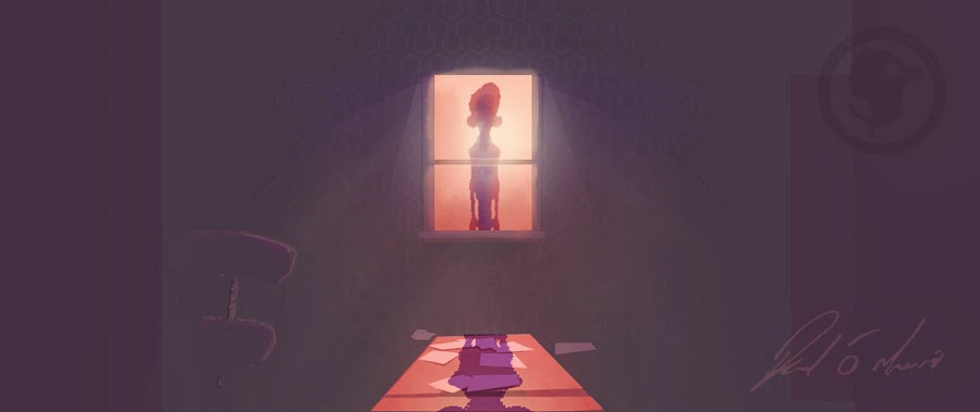
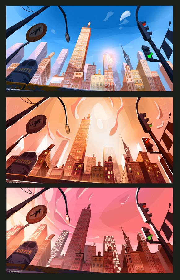
The other reason for the title is that it applies to one of the main issues i had pitching the film. In a story with skyscraper style buildings, a jazz influenced soundtrack and a vast metropolitan cityscape it was easy to assume from the script that this was a story set in 50's america. A major part of the pitch was getting across that it wasn't that the film was set in America it was simply that the films that inspired and informed me growing up were predominantly American films. Especially Looney Tunes, the Disney features, Don Bluth's features (which continued the american sensibility of Disney) and the beautiful 50's UPA stuff. It makes sense that the iconography would bleed into my storytelling, but that does not mean that it defines it. Luckily i was able to outline this in a directors statement of creative intention i had to write for the application, where i assured that what i wanted to create was a self contained world based within it's own time and place.


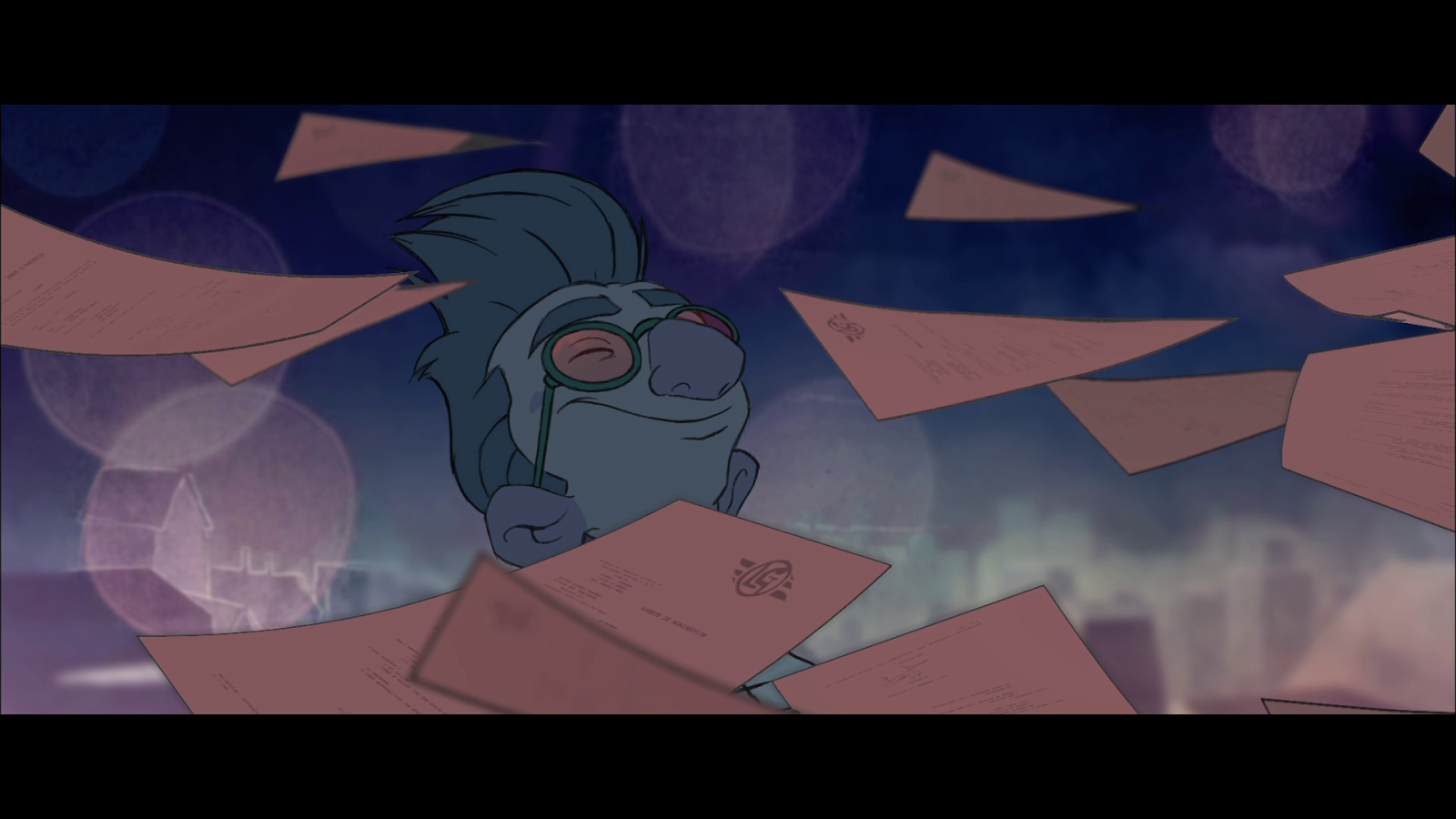
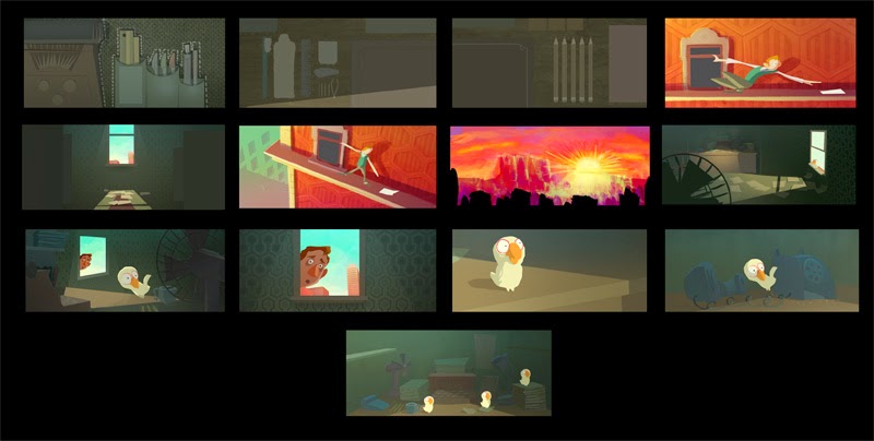
An important thing i haven't spoken about on the blog yet is that when this project began The Ledge End of Phil (from accounting) was intended to be made as a CG film. During the entire process through concept and script, up until now we were pitching Cartoon Saloon's first fully CG project! Here are some of the very first CG tests modeled and lit by Ian Claffey.


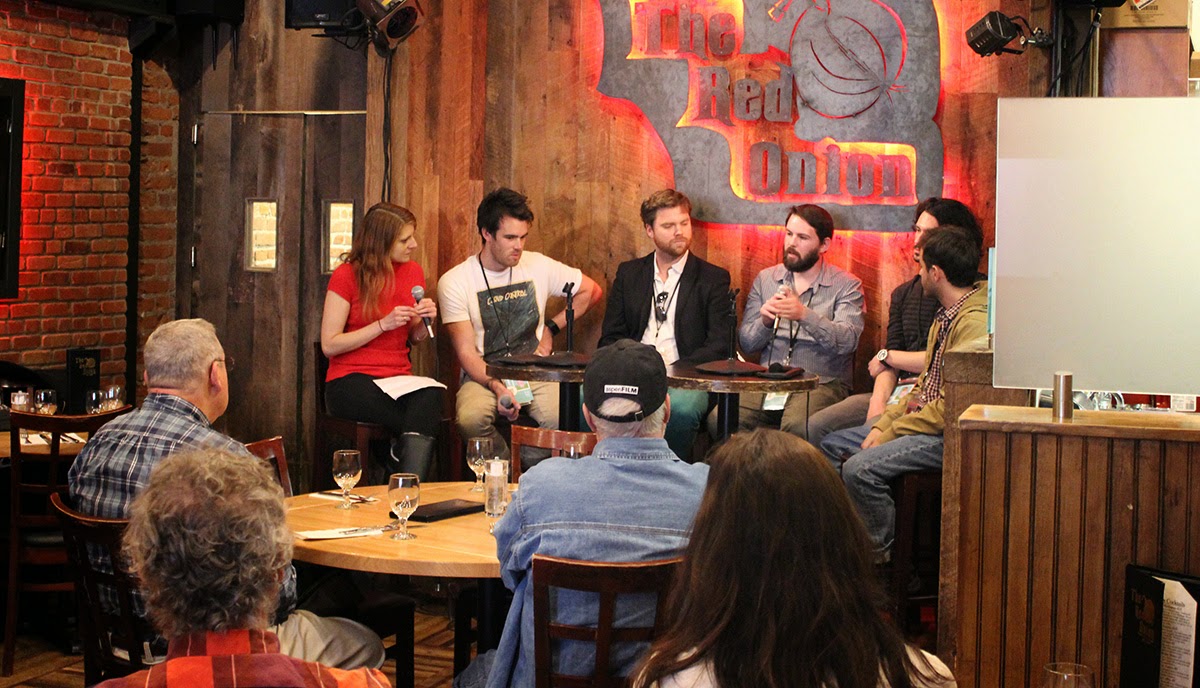
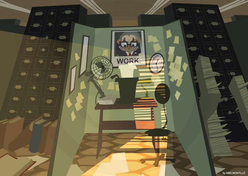
For the actual pitch itself, on a cold April morning myself, my producer on the film Pearse Cullinane and Cartoon Saloon's Paul Young (executive producer on the project), bundled into a car and set off for Dublin. We showed the artwork you've seen so far here on the blog as well as my concept pieces in this post. Paul with his usual enthusiasm gesticulated wildly on the excitement of making such a project, Pearse did his more laid back version of how we could achieve the film within the budget, then I mumbled about contrasting worlds, the power of an image and the camera reflecting Phil's narrative conflicts. Mainly though i spoke about what it was inside the story that was important to me. A man fighting his inner fears of the depth of the world around him, of losing his control. We also played pieces of the reference music to set the tone.

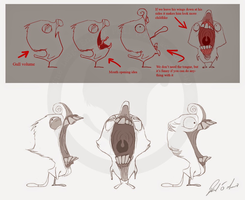
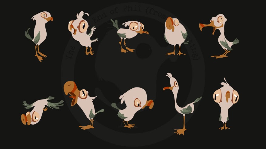
Fortunately the interviewers liked the script, they loved the seagull and the artwork, and were split down the middle as they had a passionate open debate about the hidden meaning of the title and what the ending "really" meant with each other as we sat there in pleased bewilderment.

What made my day though was that one of the interviewers asked that if we received funding that i make sure to keep the "(from accounting)" in the title, something i thought would they would immediately object to!


Obviously considering i'm writing this blog, it all worked out, we got the funding. So now we could finally start pre-production! So goodbye writing, hello artwork! In the next post we'll start looking at some early artwork and i'll talk a little more about the change from CG to hand drawn, catch you all then!